Executive summary
The new analysis confirms that the vaccines should be immediately stopped for all ages.
There is some bias in the death data reported. I reached out to the reporters and found that many people did in fact not follow instructions and reported people who they thought died from the vaccine. So I limited it to parents and grandparents and got the same result suggesting the effect is real and not reporter bias.
This method can be applied to data you collect. And it can be applied to State data.
The point is this: It’s interesting that nobody wants to produce the data to prove the vaccines are safe and effective, isn’t it?
By Steve Kirsch
Update at 5pm 2/1/23
The novel time-ratio method in this paper is sound, but certain restrictions apply to the metric that was chosen that I was subsequently made aware of after talking with Norman Fenton and Clare Craig. I am grateful to them for pointing out the limitations.
The big error was using the “date of most recent vaccination” as the “intervention point.” This is biased and will give lower numbers as a result. You can pick anything that is random with respect to the death endpoint, but that point doesn’t qualify because it is dependent on the death endpoint. Here’s the simple reasoning for why “most recent vax” is a bad endpoint. Imagine if you were vaccinated every day… You’d always die exactly one day after your last vaccination!
🚨BREAKING — Dr. Ryan Cole’s Biopsy Results May Explain The Shocking Rise In “Mysterious” Cancers — He Explains There Is Spike Protein “Inside Every Single Cancer Cell”
“What’s inside of every cancer cell? Spike protein. Every malignant B-cell has spike protein in it.” pic.twitter.com/s0UV0VV4VX
— James Cintolo, RN FN CPT (@healthbyjames) February 2, 2023
So I could have picked vax #1 date, vax #2 date, vax #3 day, etc. date for an individual (which would vary for each person), an arbitrary day of the year (assuming nothing external is happening like a Delta surge), date of vax availability, etc. You just can’t pick a start time that has implicit knowledge of the date that the person died (such as “your last vaccination before you died”). I apologize for the error.
Secondly, for the unvaxxed, the ratio is going to be <.5 because people drop out and become vaccinated. Image if EVERYONE got vaccinated in Jan 2022. Then when looking at 2021 – 2022 death reports, it would “appear” like the unvaccinated all die off in the first year which would give a statistic of .25.
Brian Mowrey wrote this critique, but the error is simply picking a biased metric; the methodology is sound. His article could have been simpler: it should have said “just use an unbiased metric such as …” In general, critiques that are constructive and spell out a fix to get to the right answer are more helpful than critiques that merely shoot down attempts to get at the truth and offer no fix. There was a trivial fix which is simply to use a specific shot #.
I also made an error in one of the columns (for the unvaxxed only).
It’s interesting to note that the data appears to be very realistic. So if you pick a random date, for example, you’ll find that the deaths (you must use ALL the deaths, regardless of vaccination status) are random with respect to that date. You can even pick a variable date, such as the date of the last full moon before the person died and that will be random as well. People do this all the time. If you make a bias claim, you should prove it in the data itself, not just make hand-waving arguments.
You can also do a center of gravity analysis using the same restrictions as above. For example, limit the deaths to N days from the selected intervention point and add up the number of days till death and divide by the number of entries. For a neutral intervention, you should calculate a number that is close to N/2.
Sadly, I didn’t collect the date of each vaccination, so I’m unable to use dose #2, etc. as my metric.
But just using the date first vaccinated yields stunning numbers. And they are significantly lower than the values if you pick an arbitrary date such as Jan 1, 2021. I also compared with May 1, 2021 and Jan 1, 2022. All had similar ratios to Jan 1, 2021. Only the COVID First Shot data had lower numbers (i.e., harmful). This means the data is good and the shots are bad.
But as of February 1, 2023 it is now obvious to anyone who wants to look at my data (and validate the entries) that the COVID vaccines should be stopped.
The data can be attacked by postulating that my followers knew about deaths from the vax or were more likely to report deaths caused by vaccination. This is true. There were absolutely people who did not follow instructions and did that.
To check for the impact of this bias, I limited the set of records to only those records for immediate family members. In virtually all cases, this means just 1 death to choose from. The result was 76342/167666=0.45. This is a strong indication that people weren’t out cherry picking the person with the earliest date of death.
When I further limited it to just parent or grandparent, the result was the same ratio: 53740/118030 = 0.45.
So when we filtered the data to eliminate potential bias, the results got worse. This suggests the overall conclusions are correct.

If the CDC was honest, this is what their new ads should look like!
Two important things to note:
- The analysis shows that the vaccine is killing people which confirms our other data so this result wasn’t a surprise.
- They authorities do NOT want to release ANY data for us to find the truth. If the vaccine is really beneficial, what is their incentive to hide the data? The bottom line is hiding the data is a tacit admission that they know the official data is devastating. So that’s why we have no choice but to use surveys like this to find the truth. The surveys put pressure on public officials to release the statewide data and when they don’t, … well, you know what THAT means!

You may ask why is the data for Jan 1, 2021 greater than .5? Simple. We included everyone who was vaccinated so anyone in that dataset had to have lived until they got vaccinated which biases the data in favor of living longer.
But there is no bias whatsoever when we use the start date of the first vaccination and all the numbers are <.50. That is very troubling for the safe and effective narrative.
Here is the data for picking a May 2021 starting point (vaccinated only):

Here is the data for picking a Jan 2022 starting point (vaccinated only):

The key here is that the only “odd ball” is shot #1 of the vaccine that is showing up to be deadly (for all age ranges).
However, as I noted above, the fixed date is not fair for the vaccinated (since it will overstate the ratio since you have to be alive to be vaccinated), and it’s not fair for the unvaccinated since it will understate the ratio (since people move out of the unvaxxed category over the 2 years).
To calculate a fair p-value, we’d have to compare with the complete dataset of all people who died, ignoring the vaccination status. This eliminates all biases. It’s basically just people who died in 2021 and 2022. The numbers > .5 reflect two things possible things going on:
- In 2022 more people died (remember 2/3 are vaccinated and as they got additional shots over time, they were more likely to die after the latter shots)
- A small amount of recall bias where people are more likely to recall a death that happened recently than more than a year ago
- For younger people, the vaccines rolled out later. So a young person was more likely to die in 2022 than 2021 because of the shot rollout schedule for young people

The p-value is stunning.
To compute the p-value, I used the days alive, days dead for the vaccinated group (using date of first vaccine given) vs. the entire dataset into a Fisher exact test.

Finally, the important point of this article is this: we have an objective way to judge the safety of an intervention using death and vaccine records. What we lack is the data to use it on. That’s the big problem here: the lack of data transparency. No one will release this data needed to assess vaccine safety voluntarily. It’s a simple JOIN between two tables and there are no privacy issues (since all we need is “an 85 year old died on date xxx and he was vaccinated at these dates using X vaccine”). Why do you think they are hiding this data?
We have a problem of data censorship. If they didn’t censor the data, everyone would know if the vaccines are safe or not. Why are they hiding the data?
John Beaudoin and I have been calling for this data to be set free and made public. Nobody in the mainstream infectious disease or epidemiology community seems to care about seeing the definitive data. Neither does the CDC or FDA or White House or Congress.
The data exists in VSD. But the CDC won’t allow anyone to see it.
The data exists in many state health departments. But you can’t FOIA it because it requires a join to avoid PII problems and FOIA requests are not allowed if they generate effort like that.
So we just have 6 different secret ways to get the data that we can’t talk about. Sooner or later we’ll get it.
Finally, with the above corrections, I’m re-enabling my 10X bet.
Executive summary
This is the most important article I have ever written in my life.
It shows a novel method that anyone can use to prove that the COVID vaccines are leading to premature death in anyone who takes them, no matter what age. So you don’t have to believe me. You can collect the data yourself and do the same analysis I did. It’s very easy. It took me about an hour to collect the data and analyze it.
The methodology is both technically sound and objective. Anyone can collect their own data including any state in the US and many foreign governments. I predict no one will look. That tells you everything you need to know.
I asked UK Professor Norman Fenton to critique the method I used here. More about him in the text below. Bottom line: he loved the method I used (which he hadn’t seen before), he validated the calculations in the figure below, and he wasn’t aware of any way the conclusion could be legitimately challenged. There are always all sorts of hand-waving arguments such as “your study wasn’t IRB approved” or “your study is unethical because you are looking at deaths from the COVID vaccine” but they are just that: hand-waving.
To further prove my article cannot be challenged, I am pioneering a unique approach to that as well that is fair, thorough, and transparent. I’m publicly offering 10X your wager to anyone who believes that the data actually shows the opposite of what I claimed. See details of the offer in the text below. If you think I got it wrong, you can turn $25K into $250K in days!
This article describes how a simple objective analysis of objective death data (age, date died, date of last COVID vaccination) can be used to prove beyond a reasonable doubt that the COVID vaccines are shortening lifespans and should be immediately halted.
This explains why all the world’s health authorities are keeping their data secret; their data would reveal that all world governments have been killing millions of people worldwide. No government wants that disclosed. They won’t debate me on this. They will try to censor this article because they can’t hide from the truth. Or they will try to create FUD by arguing the survey is biased without describing the bias.
I predict that this article will be ignored by the mainstream press and the medical community. The longer they ignore me, the worse it will look for them. The first rule of holes is that when you find yourself in a hole, stop digging.
Unless there is a serious error in my methodology or someone can explain precisely how surveying “my followers” creates a biased sample that shifts the numbers for the vaccinated or shows us a more comprehensive, trustable data set, the game is now over.
If the vaccines are safe, the CDC should have produced this analysis using statewide data long ago. It is trivial to do. Why didn’t they? The answer is simple: because they know it would blow the narrative and prove to the world that they are incompetent fools.
If you want to prove me wrong, let’s get the statewide data from all states and make it public. All we need is Age, date of death, date of last COVID vaccine. That does not violate HIPAA or a dead person’s privacy because there is no PII.
But states will refuse to release that data because they know if they did, they are finished.
So in the meantime, they will say, “Your survey is biased.” But nobody can explain the “bias” that explains the result because my readers DO NOT CONTROL THE DATE THAT THEIR FRIENDS WERE VACCINATED, their age, or the DATE they died.
My readers may be more affluent than the average American so that’s a bias. But if the vaccine is killing affluent people, we have a problem. My readers might be more intelligent than the average American, so that’s a bias. They may have more intelligent friends. So this survey, it could be argued, just shows that intelligent people are being killed by the vaccine. That SHOULD be a stopping condition.
Or you could argue that my readers are less intelligent than the average person. And once again, unless you are trying to cull a society, that should be a stopping condition as unethical.
ANYONE CAN REPLICATE MY SURVEY if you think it is “biased.” The New York Times could replicate my survey and prove I’m wrong.
But they won’t.
And that tells you everything you need to know, doesn’t it?
If they want to argue with this article, THEY need to show us THEIR data and not engage in hand-waving arguments to create FUD that have no evidentiary basis.
The game is over. We have won. You cannot hide from the truth any longer.
We’ll see if anyone wants to challenge this article and get paid 10X their wager if they are right. Bring it on!
Introduction
This article is a follow up on my article entitled, “The death records show the COVID vaccines are shortening lifespan worldwide.” That article gives John Beaudoin credit for being the first to realize that linking the death and vaccination records (a table join) is key to ending the false narrative.
In this article, I show a clever new method for analyzing the death/vax records that is simple and objective; it relies on just a simple division of two time measurements.
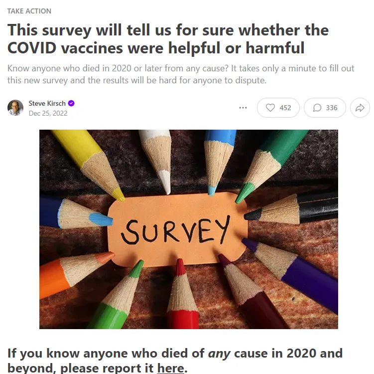
The survey
A month ago, on December 25, 2022, I announced the survey below.
The survey asked people if they knew anyone who died in 2020, 2021, or 2022.
If they did know someone, simply report objective facts about the death: age, date died, and if vaccinated, the date most recently vaccinated.
If people knew >1 person who died in the period, just report the person whose details you are most familiar with (e.g., family member vs. friend).
As of January 29, 2023, I received 1,634 responses. The analysis here looks at the responses.
We only consider OBJECTIVE data and our analysis is OBJECTIVE. It’s all math.
If the vaccines are causing death, the analysis will pick it up.
Methodology
The analysis is done by looking at “days in category before death” divided by “days possible in category if you had lived to the end of the observation period.”
We do this for both vaxxed and unvaxxed people… across all ages, and also in various age ranges which I arbitrarily chose. You can choose your own if you don’t like the age categories I chose. It won’t change the result.
Here’s how the method works (credit to Clare Craig who suggested this wording):
Imagine a timeline for 2021 and 2022. For the unvaccinated we would expect an even distribution of deaths over time except for seasonal differences. For each person, we can compare how long they did live in that period with how long they could have lived. A few who died early would have lived for only a tiny fraction of their potential and a few that died late for a large fraction. However, most will be in between and the mean will be 0.5.
For the vaccinated, we start the clock on their date of their last vaccine. The timeline will therefore vary for each person but with a harmless vaccine we would still expect exactly the same distribution – a few early, a few late and most in the middle with a mean of 0.5.
If the vaccine killed people we would end up with more deaths early on. The mean ratio of life lived compared with life that could have been lived will fall below .5.
Given ratio=((time in category)/(time possible in category)) and knowing that the person died sometime in Jan 2021-Dec 2022, we have:
- If the intervention (i.e., the vax) does nothing, ratio = .5
- If the invention shortens life, ratio <.5
- If the intervention increases lifespan, ratio > .5
It’s that simple. The important thing is that the ratio tells us if the intervention is helpful, neutral, or harmful.
The analysis is independent of the rates people die. The fact that older people die faster than younger people is immaterial. Pre-existing conditions, etc. do not matter.
There is an argument to be made that people who got vaccinated first were more vulnerable and were more likely to die, and thus the rate in a category changes over time, but that effect isn’t very large. I’ve run the numbers for those who died and were last vaccinated in 2022 and the numbers are all less than .5. You are welcome to prove me wrong, but you’ll need to do it with evidence, i.e., actual queries and not hand-waving arguments. Numbers talk.
To date, everyone who thinks they can debunk this has produced only handwaving arguments and no analysis.
Sorry, but that’s not very convincing.
Limitations
My survey includes reporters from all over the world, but all the readers speak English and 70% are in the US. The data can be analyzed just for the US and for specific vaccines as well, but below I include all the records to show that I’m not cherry picking and also to get more stability in the numbers (fewer data points creates more noise).
The people who answered are my followers and are most unvaccinated themselves. They are reporting deaths of the person they know the best, whether vaxxed or unvaxxed. I invite fact checkers to validate that people were true to the direction they were given. There are more vaccinated deaths reported simply because 75% of the US population is vaccinated.
The percentage of unvaccinated to total deaths was 29% (222/(222+542)).
So you might think “Ah ha! That proves that the unvaxxed are dying at a higher rate than the vaxxed because it should be only 25% of the deaths that should be vaccinated so this PROVES the vaccines are saving lives!”
No, it just proves that unvaccinated people hang around other unvaxxed people and are slightly more likely to report their deaths.
This is very helpful for our survey for two big reasons:
- It gives us enough data in both the vaxxed and unvaxxed buckets so we can do meaningful comparisons between the two buckets
- I can’t be accused of bias, e.g., you anti-vaxxers are just reporting vaccinated deaths to make the vax look bad. Clearly this isn’t the case… they are reporting disproportionately more unvaccinated deaths. So it looks very credible because it’s consistent with what you expect to see.
Note that the mix of vaxxed/unvaxxed deaths is immaterial to this analysis. Each cohort is examined independently. If I had 50% vaxxed and 50% unvaxxed deaths, the results would be exactly the same.
It’s important to note that my followers cannot determine the date of death of unvaccinated or vaccinated individuals (unless they have God-like powers). And I have contact info for all the records so they can be “spot checked” to validate that people followed my instructions to report the person they are most familiar with.
There is a recall bias in that people are more likely to report deaths that happened more recently. This shifts the average death time to the right. This is why unvaxxed are > .5 (more about that later).
For vaccinated people, there is also a healthy patient bias. If you are going to die in days due to a fatal cancer, most people would not get vaccinated.
There is some amount of seasonality in deaths that might skew things somewhat. It’s minimal for those <60, and small for the elderly. But we’re looking at a 2 year period so it shouldn’t be much different between vaxxed and unvaxxed.
Gaming
It wasn’t possible to game the survey because nobody, including myself, knew how I was going to analyze the data until after the data was collected.
There was one person who put in a bogus entry (record #260) but that was easily spotted and removed.
The analysis cut off time was before this article was written so anyone trying to pollute the data will be unsuccessful since any new records aren’t included in the analysis.
Transparency
The database has been in public view the entire time that the data has been gathered. When a record is submitted, it appears in the public view.
Verifications
No submissions were deleted (other than record 260 which was clearly gamed) or modified which can be verified by the changelog of the data. The database is hosted by a third party firm.
There is an “integrity check” field indicating which records passed simply sanity check such as date vaccinated < date died. Only those records were processed.
I have the contact information for each reporter. I am looking forward to being contacted by any mainstream “fact check” organization who is willing to be recorded on video as we discuss the article. I’m happy to supply contact info for any line(s) in the survey so the fact checker can verify every record is legitimate.
Expectations
People who die within 2021 to 2022 should be expected to die evenly throughout the period (there is some seasonality so it isn’t flat over the calendar months). Therefore, with no biases, we’d expect that the average days of life is 1 year in any 2 year observation period. So a ratio of .5. The seasonality cancels out.
But due to recall bias (since we are asking people to recall deaths rather than using government records), we’d expect the number to be skewed to dying more recently so maybe we’d see a ratio of .55 for the unvaccinated.
The vaccinated benefit from both recall bias and the healthy patient bias, so it might be .58 or more.
If the vaccines are safe and effective, the ratio of the vaccinated > ratio of the unvaccinated due to the healthy patient bias.
If the vaccines are killing people, the ratio of the vaccinated <= ratio of the unvaccinated (since the healthy patient bias would give the vaccinated an advantage).
If the vaccines are killing people, the ratio will be <0.5.
If the vaccines are safe, the ratio will be >0.5.
Guess what we found? 🙂
The results
The data couldn’t be more clear: the shots are killing people.
The data is remarkably consistent.
See the section at the start of this article for the results.
For the vaccinated, my Airtable filter looked like this and I used the Vaxxed days died/days available columns.
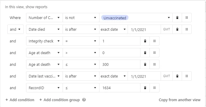
NOTE: The “Integrity check” is NOT complete. But when coupled with the restrictions of the two filtering conditions, invalid records are all filtered out of the final result.
Is my analysis wrong?
This is an Occam’s razor analysis. You could get fancier but it wouldn’t change the result. The signal is very very strong that the vaccines should be immediately stopped.
If I have made a mistake, I’d be grateful to see the correct analysis of the data using the same methodology. So if you object, show us the proper analysis.
The data is remarkably consistent for each age range. But there is a huge difference between the vaxxed (.3) and the unvaxxed (.58). This is exactly what I expected to see; no surprises. But it’s IMPOSSIBLE for the blue-pilled medical community to explain how this could possibly happen if the vaccine is so safe since it was supposed to be the other way around.
A simple look at the Notes field confirms the role of the vaccine in these deaths. That’s subjective proof. It shows that the vaccines are not as safe as claimed.
As far as confidence intervals, the numbers are remarkably consistent so the confidence intervals appear to be small. I’ve asked Professor Fenton for the correct way to ascertain these. He’s thinking about it. I’ll update this when I hear back.
But there’s more confirmation…
Failure anecdotes » success anecdotes
Is this analysis consistent with reliable evidence? Yes.
It turns out for the COVID vaccines, the best evidence we have is anecdotal evidence where everything is tracked since government data can be badly wrong as we learned in the UK where mistakes led them into thinking the vaccines were safe (see UK ONS admits their data is flawed; the vaccines may not be beneficial after all. Sorry about that).
As it turns out, it’s easy to find failure anecdotes for the COVID vaccines. The anecdotes we generally find show STRONG failures.
By contrast, it is nearly impossible to find a “success anecdote,” even a weak success. I always ask doctors who will talk to me and they’ve never mentioned a single success story. I do this constantly on Twitter Spaces in full public view and NONE of the DOCTORS will EVER be able to cite an example. In fact, I have not found any medical doctor who has ever been able to cite a single geriatric practice or nursing home where deaths dropped after the vaccines rolled out.
If the vaccines were saving lives, there should be THOUSANDS of “poster elderly” success stories, yet there are none. All the anecdotes are strongly negative. That’s simply impossible if the vaccines are saving “tens of millions of lives” as Neil deGrasse Tyson said on YouTube. When I called Neil to ask him for a success anecdote, he hung up the phone on me.
So we have a pretty good sense just from the failure to find a success that the vaccines are an utter disaster. We didn’t even need to do any numerical calculations!
Lots of things confirm our hypothesis:
- Lack of success anecdotes, but failure anecdotes easy to find
- People switch from pro- to anti- but not the reverse.
- Nobody can explain the 15,000 excess deaths in VAERS for the COVID vaccines. It’s not there for other vaccines, the deaths are all consistent with vaccine deaths. What killed all these people if it wasn’t the vaccine?
- Ed Dowd’s book “Cause Unknown” contains tons of data. Where is the document debunking everything in that book and showing the cause of all these deaths, especially the increase in child deaths happening right after the vaccines rolled out for kids.
- What about the 770 safety signals in VAERS. Why didn’t the CDC tell anyone about any of those signals? They notified the public about the VSD signal for stroke and didn’t even mention that it also triggered in VAERS.
- MIT Professor Retsef Levi calls for a halt to the COVID mRNA vaccines based on his study and others.
- The vaccine isn’t as effective as the NEJM led you to believe. A key paper is deeply flawed. In fact, it shows very troubling data as people will soon see: that the vaccine makes .

- Large Cleveland Clinic study shows the more you vaccinate yourself, the greater the risk of getting COVID. Whoops!
- A New Zealand funeral director noticed 95% of his cases died within 14 days of the shot. I spoke directly with Brenton. He lives in the middle of a retirement community. This is the very age that is supposed to be protected by the shots. Average age is 70+. His records can be verified. Any takers?
- Embalmer Anna Foster found that 93% of her cases had telltale rubbery clots. How can anyone explain that? She is hardly alone… 80% of embalmers surveyed report seeing these new style blood clots; they have never been seen before the COVID vaccines rolled out.
- Southwest airlines: Pilot deaths have increased 5X after the vaccines rolled out and disability shot up by 10X normal. Pilots are among the healthiest people on the planet.
- Geriatric practice: I finally found a large geriatric practice of 1,000 patients, 75% are over 65. Their normal death rate is 11 per year (the mean). In 2022, they had 39 deaths for the entire year. They attribute the 28 excess deaths to the vaccine. If it wasn’t the vaccine, someone needs to explain to us what is killing these people because whatever it is, it needs to be IMMEDIATELY stopped. They can’t go public for fear of retribution.
- Savo Island Cooperative (Berkeley, CA): Roughly 150 people. No deaths for 5 years before COVID; 0 in 2020; 1 in 2021; 3 in 2022 and they were all vaccinated and boosted (plus 3 strokes and 4 heart attacks). Reported to me by Jane Stillwater last night at an event I spoke at. Nobody at the event could recall any success anecdotes.
- Ed Dowd mentioned the vaccines have killed 800K Americans and disabled 4X as many as killed, 3.2M since the vaccine program began.
- The peer-reviewed scientific literature published a paper by Mark Skidmore showing over 217,000 deaths in 2021 alone due to the COVID vaccine. But they are looking at retracting the paper because Mark didn’t include a full bio on one of the funders of the study. Also, he asked a question about deaths from the COVID vaccine and that’s unethical (COVID virus questions are OK and ethical).
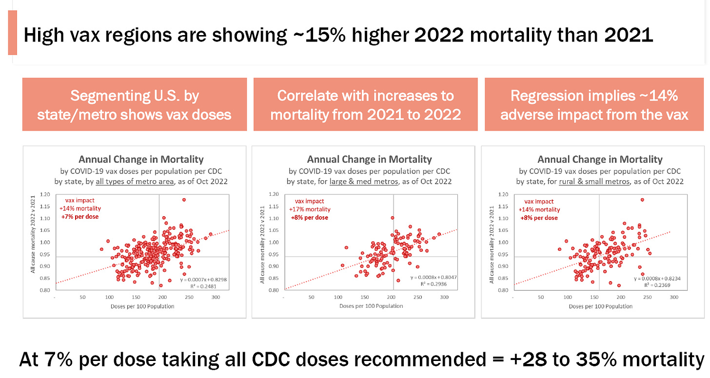
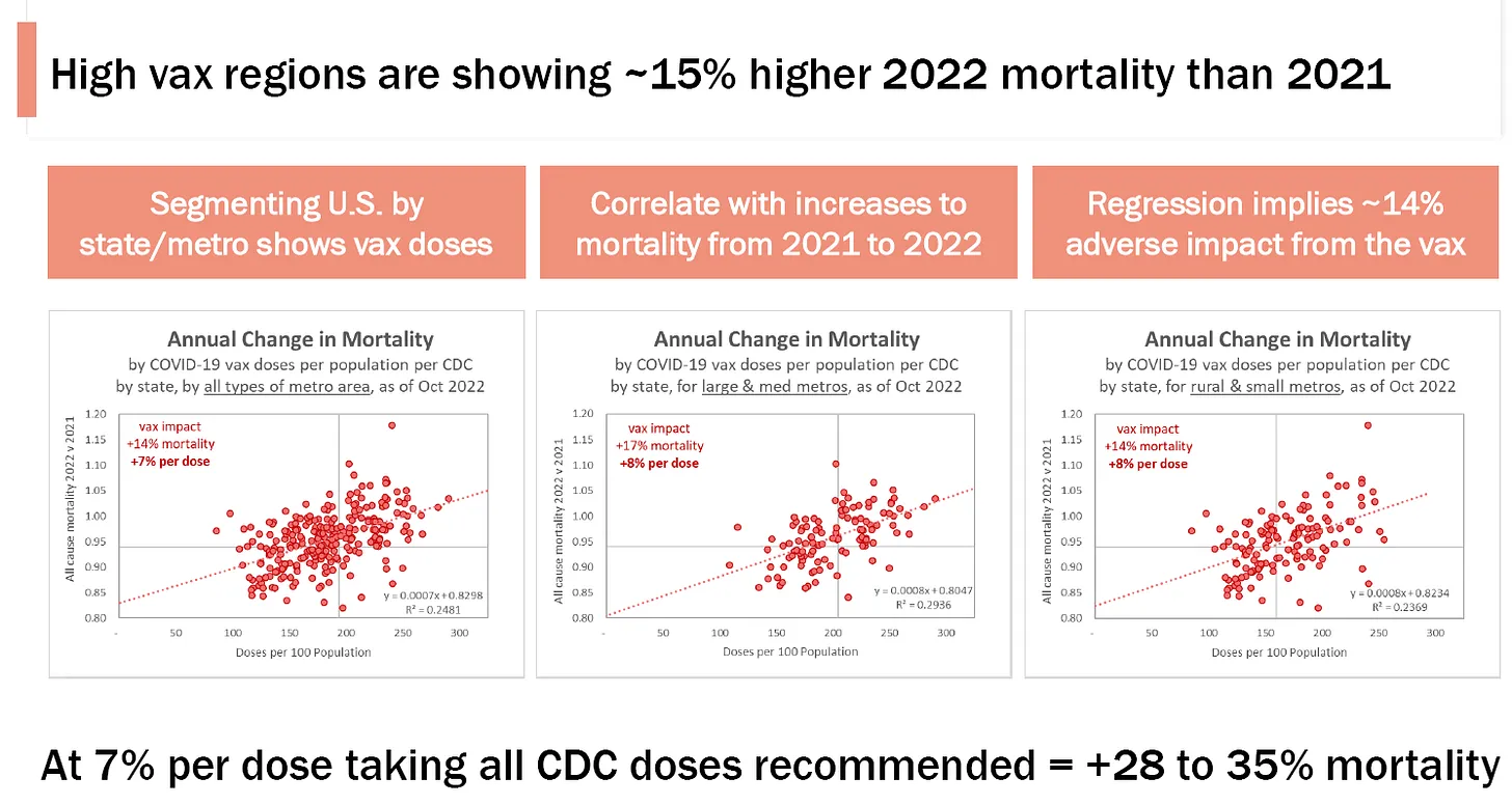
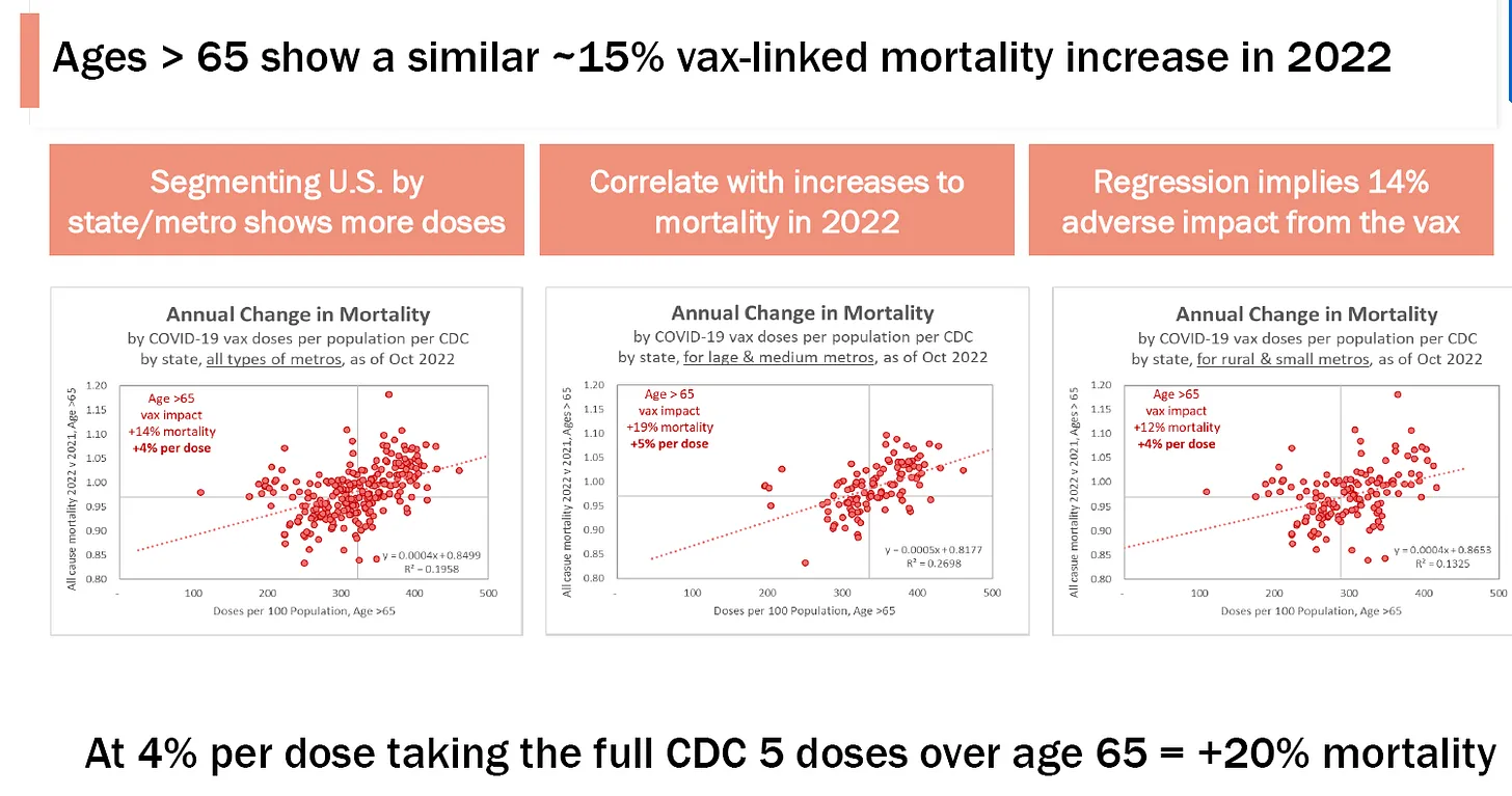
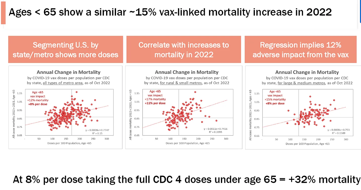
- Josh Stirling looked at how cities in the US did in 2022 vs. 2021. So it’s a longitudinal study where you compare the city with itself one year ago. This is the best way to see what is going on… did your mortality increase or decrease. Check this out: cities with higher vaccination had larger all-cause mortality increases than cities with lower vaccination rates. In other words, the line goes the “wrong way.” This is devastating for the narrative, but of course consistent with what the death reports are saying. The R2 doesn’t need to be .9 for this to be convincing. They are correlated and it’s the slope of the line that is significant. The slope is the wrong way. That’s the point.

-
Ages <65 version of the above
Where is their analysis of their data using my method?
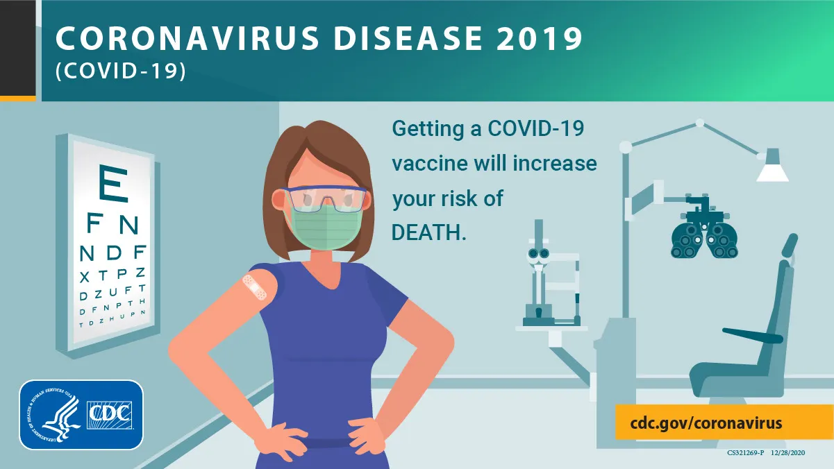
If the CDC doesn’t surface the statewide data for the public to see, then I believe it is time for the CDC to change their ads to look something like this:
About Norman Fenton
I’ve had both the method and the data reviewed by UK Professor Norman Fenton. He’s the guy that proved the UK government data was fraudulent and cannot be used to prove the vaccines work (see the official full response at the bottom). Nobody else in the world had been able to do that. Nobody wants to debate Norman on any of his work because it is so impeccable. The top medical journals also hate him because he finds serious errors in key papers published in their journals (such as The Lancet and Science). He validated it as sound and reliable.
Other reviewers
Others, such as Clare Craig of the HART Group, called the method described here “genius.”
I can publicly prove that NOBODY can challenge this study… I’m even offering 10:1 odds in your favor!!
How about a novel fully open peer review process for this analysis that is not subject to the whims of the scientific journals and shows to the public that the article cannot be attacked by anyone in the world?
You send me your wager via Solana blockchain and I’ll give you 10X your wager if you can show we got it wrong and the data shows the opposite conclusion.
Professor Fenton will judge your entry. He has high integrity and is on the side of truth.
The way it works is that you send me your wager ($5K to $10K worth of Solana) as your entry fee to: 9BBhGEfAMSHg8Mxyb4x67VKMhyomJ3MAPa9mqXtaP8xZ
with a comment with your contact info (or the contact info of your lawyer if you want to remain anonymous).
You can use Ledger Live or Phantom which supports adding a note to the transfer.
This will create a public record for all to see that you are accepting my offer. If you win, you get 10X your wager sent back to the address you sent your funds from. If you lose, you lose your deposit. This ensures people aren’t wasting my time with non-serious challenges.
Also, the size of the wagers tells you how confident people are in their analysis. I predict no one will wager anything. If I’m wrong, I lose a lot of money.
I’m kept honest by the public nature of this. People could legitimately discredit me if I don’t honor my offer. That would be a first.
Your burden is to show that my analysis of the data is flawed and that the data that was submitted to me actually shows the opposite: that the vaccines are saving lives.
People can look at Solscan to see the entries so that everything is in full public view. No gaming is possible. If there is a transaction, you can look at the “Memo Program V2” to see the notes for who is challenging me.
Fenton’s decision will be in writing as well and subject to public scrutiny. He has no history of not following the science. If you can produce evidence of this, I’m happy to pick another judge.
So if there are no challenges at my 10:1 odds, it’s de facto proof that I’m right.
It’s a novel method of public peer-review that is impossible to game or censor. It is open to anyone worldwide.
Make my day. Or as data scientist Joel Smalley might say, “Put up or shut up.”
My offer is open to the drug companies as well or any other institution.
Terms:
- Offer terms can be changed at any time (e.g., I may want to raise or lower the min/max bet).
- Send wager to: 9BBhGEfAMSHg8Mxyb4x67VKMhyomJ3MAPa9mqXtaP8xZ
- Min/max wager is currently: $5/10K
- First come, first served. The Solana blockchain is the source of truth for the entry timing.
- Maximum of only one winner. If someone wins, any deposits received after that person will be refunded to the address of the sender.
- Disputes will be settled by JAMS mediation.
- Your sending me the Solana with the contact info signifies your acceptance of the offer.
- Professor Norman Fenton will judge your submission in a live Zoom call that is recorded and publicly broadcast. You will have 1 hour to present your argument. He will put his decision in writing and post it to his Substack.
- To win, you must show that the data shows, for all age cohorts, that the vaccines are neutral or beneficial. You can show this using my data (preferred), or, if you can convince Fenton that my data is unfairly biased, you can use it on your own dataset provided you can convince him that your data was fairly collected in a neutral manner (which includes complete state data joining the death and vaccination database tables). If the data is privately collected, prospective collection by a neutral party is preferred since otherwise the provenance of the data would be hard to prove.
- You can attack the method, the data, or both to prove your point and make your case.
- Offer expires March 30, 2023 to encourage submission.
- You can request a written, legally enforceable definitive agreement if you don’t trust me. Use the Contact Me link and include the name and phone number of your attorney so we can work out the details.
- Anyone can enter, individuals, corporations, etc. including, but not limited to:
- CDC Director Rochelle Walensky
- All the vaccine makers
- Tom Shimabukuro and his pal John Su of the CDC (these are the guys who hid the 700+ safety signals from the world; see this article on the death safety signal and this article on 700+ safety signals)
- The people at the CDC and FDA who put me on the email block list so that I was not able to speak at the public comment section of the FDA or CDC meetings which violates my rights to free speech… I get it ….. if you can’t argue based on the data, you censor your opposition. That’s the way science works at the FDA and CDC.
- Tedros from the WHO who just declared COVID to still be an emergency…what a fruitcake!
- UCSF, Stanford, Harvard, MIT, …
- Executives at YouTube, especially those involved in censoring truthful content
- All LinkedIn executives involved in the decision to ban me for life on LinkedIn
- Medium CEO Ev Williams for supporting the decision to ban me for life
- All Wikipedia executives for supporting the decision to ban me for life and supporting the efforts to trash my Wikipedia profile to make me look like a menace to society. And how dare you remove my National Caring Award from my Wikipedia profile. You are a truly evil and corrupt organization.
- Stanford Professor and ACIP Chair Grace Lee who would rather call the Palo Alto Police on me than watch the video from the Israeli Ministry of Health proving the vaccines are not safe. Watch the video; it is a classic (Pierre Kory loved it).
- CDC
- ACIP and VRBPAC committee members
- The comedy team of US Surgeon General Vivek Murthy and Ashish Jha
- ZDoggMD
- Dr. Susan Oliver (along with her dog Cindy Oliver)
- Your Local Epidemiologist (YLE)
- David Gorski
- Jonathan Jarry
- UPenn Professor Jeffrey Morris
- Paul Offit
- Peter Hotez
- Truth warrior Dr. Angela Rasmussen
- Eric Topol
- Anthony “I am the Science” Fauci
- “Debunk the Funk” aka Daniel Wilson
- Bob Wachter, Dean of Medicine, UCSF
- Lloyd Minor, Dean of Medicine, Stanford University
- Harvey Cohen, Stanford University
- 60 Minutes
- The New York Times
- The Wall St. Journal
- The Washington Post
- The BBC
- Reuters Fact Check and any other so-called “fact checker”… and even Dr. Adrian Wong
- All of the members of the CETF SAB… the ones who said I was wrong and that they never wanted to speak to me again
- Any member of US Congress
- Any world leader who is pushing these vaccines
- Any health official anywhere in the world who is pushing these vaccines
- Neil deGrasse Tyson… who hung up on me when I challenged him on his bullshit statement that the vaccines have saved millions of lives. Give me a break.
- Their champion (if I can find him/her)
What a joke. None of these people can show I got it wrong.
Not a single one of them has publicly called for exposing the data so the public can learn the truth.
They are all afraid of the truth, the whole lot of them.
And if they can’t show I got it wrong, they should publicly admit I got it right. That would be the right thing to do.
The burden of proof
The burden of proof is on the authorities to show that the vaccine is safe especially now since most people are not taking the shots.
They should produce the death data and make it publicly available for analysis. That would end the debate.
Ideally, for every person who died in 2019 to the end of 2022:
- Age
- Date died
- Date of each vaccine
- The vaccine type for each shot
- The total number of doses given
Summary

The method presented in this article is a simple, straightforward analysis that can be used with death records to reveal the truth about the vaccines.
The results I obtained from over 1,500 death records are self consistent and are consistent with other data we have collected. I wasn’t surprised at all to get this result.
If anything, the vaccinated should have done better than the unvaccinated in this survey because of the healthy patient bias effect. But, as we found, it did far worse. Reading the comments in the death submissions confirms that a large number of cases are vaccine related.
Also, it is remarkable that the #1 feature of a vaccine death is “died suddenly.” Does that sound familiar?
The study cannot be attacked as “biased” unless you can explain how my followers can either 1) cause the premature death of vaccinated friends OR 2) deliberately ignored instructions to report the person they knew the best and instead they all followed a different set of instructions that they magically all agreed on.
That’s far fetched because:
- Most people who reported a death only knew one person who died. So it’s not like they can choose the “best” answer.
- Because they are my followers, they’ll want to help me and that means following my instructions which was to choose the friend whose details they knew the best
- At the time the survey was done, nobody knew how the data would be analyzed, not even me. They would have to ignore the instruction they were given and instead follow the “proper algorithm” in massive numbers. Why would they ignore my instructions? They are my followers and want to help me! And how would they know the “correct” instructions?
So where’s the evidence of bias?
There are only three ways to legitimately attack this study:
- Show an error in the methodology and show us our data that is correctly analyzed and where the medical community agrees you have the CORRECT analysis.
- Show an error in the data. I’m happy to have someone contact random people who answered the survey to ask those people if they followed the instructions to report the person they knew the best or not and if not why not.
- Show us a larger dataset showing the opposite result where we can verify every record with the primary data source. For some reason, no government will show us the record level data where the death age and date of death is tied to the vaccination records. Critical thinkers want to know: if the vaccine is so safe, why is this data being hidden from public view?
The bottom line: the COVID vaccines increase your chance of dying for every age group (that we had sufficient data on) and should be immediately halted. They are the biggest mistake in modern medical history. This analysis is completely objective, the data is very consistent, there is no evidence of bias that could explain the outcome, and there is no escaping the truth.
The medical community needs to take sides on my article and stop sitting on the sidelines. They have an ethical obligation to immediately either:
- call for a halt to the COVID vaccines or
- show us how we got it wrong by either showing the correct analysis or by producing a more comprehensive dataset.